

A business looks professional online when people can understand its offer, find credible evidence, and take the next step with confidence. Its website, social profiles, and customer communication should feel like parts of the same organization.
Visual design gets attention. Clear information and dependable service give that first impression substance. Good website development brings those elements together so visitors can evaluate the business and decide whether to reach out.
Your homepage should quickly explain what you do, who you serve, and where you operate when location matters. A visitor should not need to decode a slogan to work out whether your business can help.
For example, a local contractor might lead with “Kitchen remodeling for homeowners in Austin,” then explain the scope of its work and show relevant projects. This is an illustrative example; the actual wording should reflect the company’s services and coverage.
Specific information also helps customers qualify themselves. Someone who understands your offering can ask a more useful question than someone who has only seen a broad promise of quality.
A person moving from a social post to your website should recognize the same business. Use your official logo consistently, maintain a recognizable photography style, and keep your service descriptions, hours, and contact details aligned.
On the website itself, establish a clear visual hierarchy. Headings should help visitors scan, body text should be comfortable to read, and buttons should communicate their purpose. Consistent spacing and restrained styling make the information easier to follow.
A business domain and domain-based email can support that identity. They also need reliable ownership and upkeep: protect account access, monitor renewals, and make sure incoming messages reach the right person.
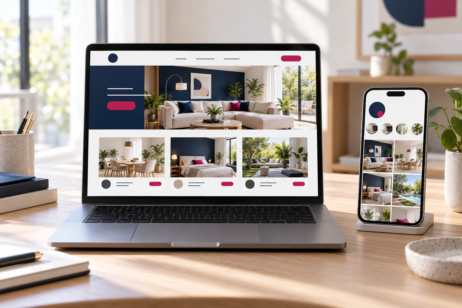
Useful proof is specific. Show work that relates to the service a visitor is considering, and explain the assignment, your contribution, and what you delivered. A polished project photo becomes more informative when the reader understands its context.
Stock and AI-generated images can illustrate an idea. They should not be passed off as your real staff, premises, or completed projects. Label concept work when a visitor could reasonably mistake it for client work.
SUGGESTED LINK: Website elements that help build customer trust.
Review the site on a real mobile device, not just a desktop preview. Content should fit the screen, images should load efficiently, and page elements should remain stable while someone is trying to use them.
Accessibility belongs in this review. Check text contrast, descriptive form labels, and keyboard navigation. These choices help people with different access needs use the site.
Complete a real customer task: find a service, review an example, and submit an inquiry. Confirm that the success message appears and that the inquiry actually reaches your inbox or customer-management system.
Good page experience can support search performance, but it does not guarantee rankings. Relevant, useful content still matters.
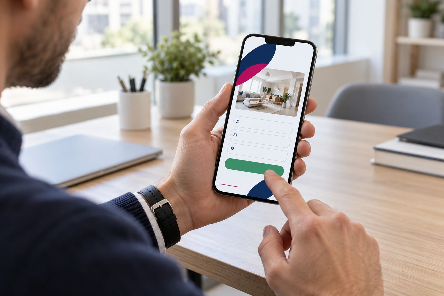
Tell visitors what happens after they contact you. Will you review their project, request a few details, or arrange an introductory call? Only promise response times that your team can consistently meet.
Keep the initial form focused. Ask for enough information to handle the request, explain how it will be used, and avoid collecting sensitive details without a clear reason.
Choose contact options that fit your customers and your workflow, whether that means email, a call, a form, or WhatsApp. The website should help people arrive at the conversation with useful context. Your reply and proposal should then match the care shown on the site.
SUGGESTED INTERNAL LINK: connecting Instagram, your website, and WhatsApp.
Start with issues that stop people from understanding your services or contacting you. Correct outdated information, repair broken forms, and resolve mobile navigation problems. Then improve messaging, project evidence, and visual consistency.
If the priority is unclear, an initial assessment can help. Consider the desired business outcome, available budget, and responsibility for ongoing updates before choosing an approach.
Track meaningful outcomes such as relevant inquiries and completed requests. A click on a contact button is not the same as a conversation; measuring them separately makes the results easier to interpret.
Yes. Its suitability, customization, content, and reliability matter. Also check whether the site will be manageable and flexible enough for likely future changes.
Not always. If every project needs an assessment, explain the factors that affect a quote and the details needed to prepare one.
No. A small, accurate website can represent a business well. A blog is useful when the company can maintain content that answers relevant customer questions.
Pixelgrafía helps businesses present their services clearly, build confidence, and make inquiries easier. The right approach may involve improving an existing website, adapting a template, or developing specific functionality.
Use the form below to tell us what your business does and what you want to improve about its online presence. We will assess which next step fits your needs.
Complete the form and we will reply as soon as possible.


