

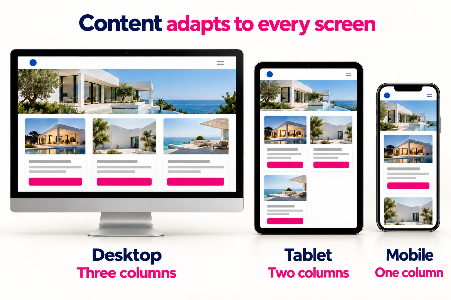
A responsive website adjusts its layout to the space available on the screen. Columns, images, and navigation change their arrangement so people can use the site on a phone, tablet, or computer.
A row of three service cards on a desktop, for example, may become a single column on a phone. The information remains available while its presentation changes.
For your business, the practical goal is straightforward: visitors should be able to understand your offer and complete the next step, whether that means requesting a quote, booking an appointment, or making a purchase.
Responsive design is an approach to building a website. Visitors do not need to install anything to use it.
A well-implemented layout allows:
The layout should also work between familiar device sizes. Someone may browse with a narrow desktop window, a tablet in landscape mode, or enlarged content.
Picture a potential customer opening your site from Instagram. They look at a project, read about the service, and decide to request a quote. If the menu covers the page or the keyboard hides the submit button, the task becomes harder.
That is why testing should follow the entire customer journey. A homepage that fits neatly on a phone does not prove that the inquiry form, product catalog, or booking tool works well.
Keep the information people need to make a decision: service scope, relevant conditions, examples, and contact options. You can reorganize it or place details in expandable sections. Removing essential information just to shorten the page can leave visitors with unanswered questions.
SUGGESTED INTERNAL LINK: connecting Instagram visitors to WhatsApp through your website.
A site can rearrange its columns correctly and still load slowly, have awkward controls, or display confusing form errors.
Making an image look smaller does not necessarily reduce the size of the downloaded file. Likewise, fitting a form inside the screen does not make its labels or instructions clear.
People should also be able to enlarge content. Zoom supports reading; it should not be blocked simply to preserve the original composition.
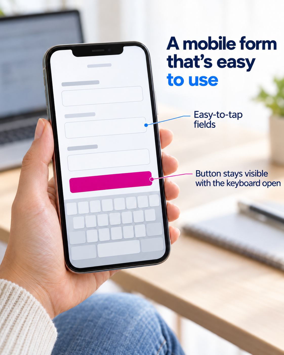
Start with a real phone, then try another screen size or browser if available. A desktop browser’s mobile preview can reveal layout problems, but it cannot reproduce every real-world interaction.
Ordinary page content should not require side-to-side scrolling to read. A wide data table or map may need scrolling within its own area without forcing the entire page to overflow.
For each issue, record the page, device, screenshot, and task you were trying to complete. That makes the problem easier to reproduce and fix.

Google uses the mobile version of content for indexing and ranking. It recommends responsive design as a relatively straightforward configuration to implement and maintain. That recommendation is not a promise of a particular search position.
Useful content, crawlability, and overall site quality still matter. A drop in inquiries also does not prove that the layout is responsible; you need to inspect the customer journey and the available data.
SUGGESTED INTERNAL LINK: why website visitors are not getting in touch.
If the site has a workable foundation and only a few components fail, targeted changes may be enough. Those might involve navigation, page styles, images, or forms. A replacement template or broader redesign becomes more relevant when the underlying structure prevents useful improvements.
A suitable responsive template can work well for a service business. Test it with your actual copy, images, and integrations: a polished demo does not guarantee that every customization will behave correctly.
Custom development is worth considering when existing solutions cannot adequately support your workflows or integrations.
No. With responsive design, the same page address can serve a layout that adjusts to the available screen space.
They solve different needs. A website may be enough for presenting services and collecting inquiries. An app should be considered around the functionality and repeat usage the business requires.
Yes. Headlines, buttons, and messages vary in length across languages. A layout that works with one set of content can break with another.
Pixelgrafía approaches website adaptation around what visitors need to accomplish: understand your offer, explore the details, and take action from the device they are using.
Use the form below this article to describe the task you want customers to complete and where they encounter difficulties. Pixelgrafía can help you assess targeted improvements, a suitable template, or a custom solution.
Complete the form and we will reply as soon as possible.


